Overview
Teachmint is an ed-tech platform for live classes, school management, and learning content. It serves students, teachers, school admins, and parents across web and mobile.
By 2022, the product had grown faster than its UI foundations. Similar screens looked different from squad to squad. Components were rebuilt instead of reused. Engineering spent cycles reconciling design debt instead of shipping product work.
I was an Associate Product Designer at Teachmint (Jun–Sep 2022). In that time I led the creation of Krayon, Teachmint’s internal design system: a shared visual language, component library, and documentation that teams could ship from with confidence. From audit to org-wide rollout took roughly four months.
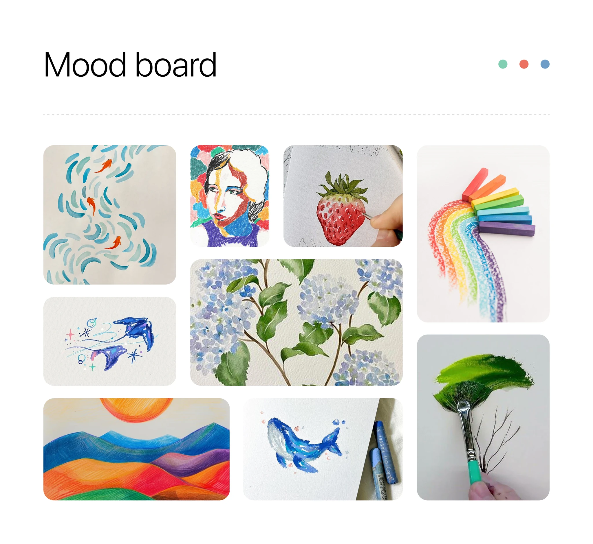
The name came from an idea: Krayon after the childhood crayon box, something familiar in every classroom. That metaphor shaped our pastel palette, soft UI, and the sense that one toolkit could colour every product line consistently.
What it was like before
Without a single source of truth, designers reinvented the same patterns in slightly different styles. Buttons, forms, and data tables diverged across modules.
- Students saw cluttered, high-contrast layouts where key actions were hard to find.
- Admins worked in dense screens that were not tuned for their tasks.
- The product felt like a collection of apps, not one platform.
- Handoffs often missed hover, error, and loading states, so design and engineering drifted apart.
What we aimed for
- One modular component library with clear when-to-use guidance.
- Persona-aware UI that still reads as one Teachmint brand.
- Documented tokens, states, and interaction patterns for engineering.
- A system flexible enough to grow with new product lines without forking the brand again.
The constraints that shaped the design
One brand, many personas. Students, teachers, admins, and parents use Teachmint differently. Density and emphasis can change by persona. The palette and foundations should not.
Typography on small screens. Type scales had to work for long reading and for dense admin data on phones, not only on desktop dashboards.
Design and engineering had to share a contract. A Figma kit alone would not fix drift. Tokens, component APIs, and state documentation had to be agreed with engineering up front.
How I worked on this
This was my first design job. I owned the visual language, core components, tokens, and dev-facing specs, across web dashboards, teacher tools, student apps, and admin consoles. Through it I was mentored by my manager and a very senior designer, Malik, who constantly helped, guided me, and taught me the basics of design.
We started with a mood board rooted in classroom artefacts (chalkboards, notebooks, crayons, graded papers) to align on emotional tone before any components were drawn.
From that direction we defined the building blocks every screen would share:
- Colour: Pastel tones for calm and clarity, with accents mapped to subjects and primary actions.
- Typography: Readable at small sizes, with a consistent hierarchy for cards and long-form content.
- Layout: Responsive card patterns tested on mobile, tablet, and desktop.
We audited live screens across squads, merged duplicate patterns into a canonical set, and tagged each component with primary use cases (admin tables vs student cards, for example). I paired with engineering on token naming, component APIs, and state documentation so hover, error, and loading states were specified up front, not discovered in QA.
What we shipped
Krayon is the shared contract between design and engineering. Not only a Figma kit, but a system teams could extend without forking.
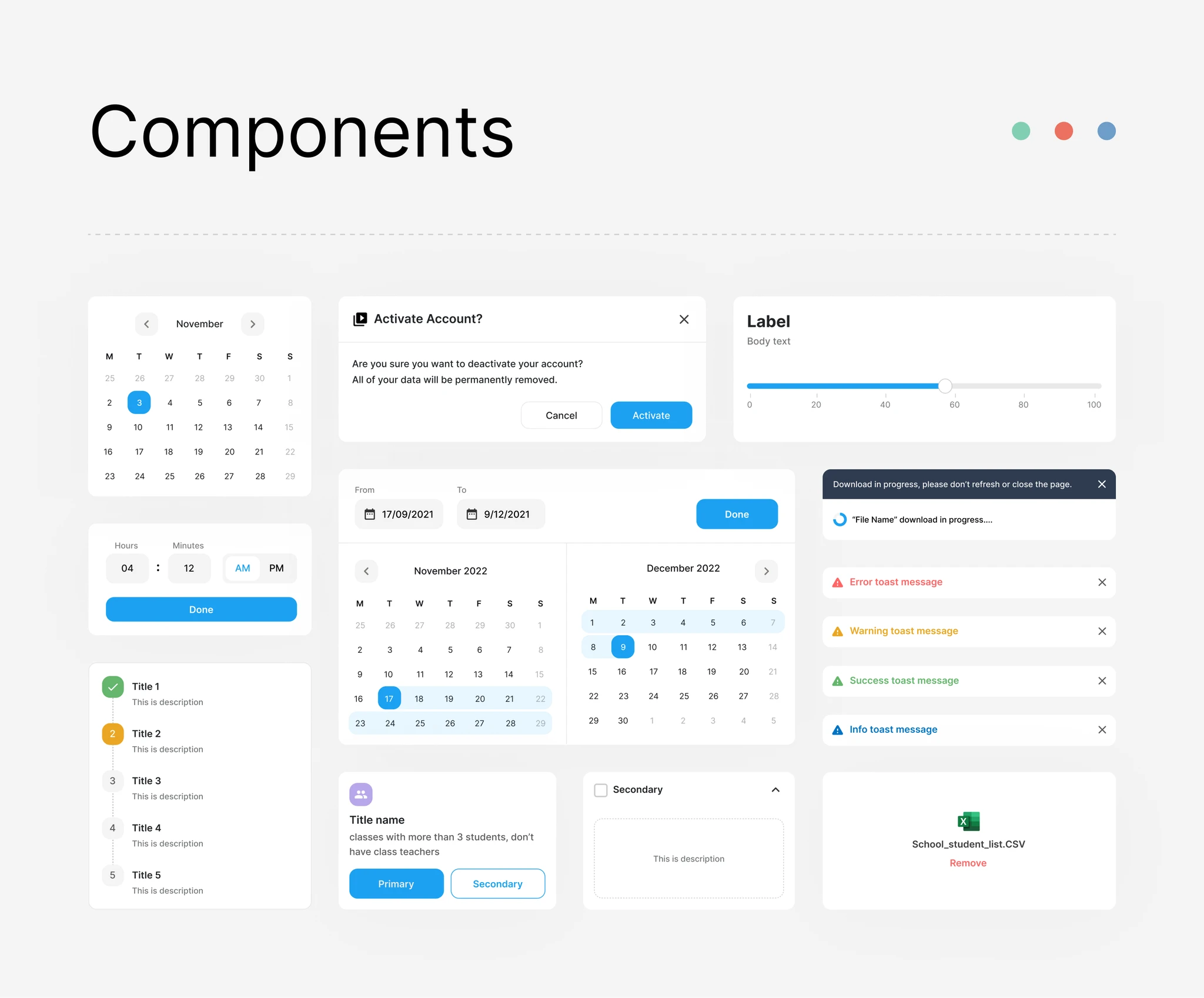
- Foundations: Colour, type, elevation, and spacing tokens.
- Components: Inputs, cards, tables, navigation, and feedback patterns built for reuse.
- Documentation: Usage notes and state diagrams so engineers did not have to guess behaviour.
- Governance: Contribution rules so new work extended the system instead of splintering the brand.
We introduced Krayon internally with a walkthrough for design, product, and engineering: migration, contribution, and how to request new patterns.
Outcomes
- Shorter design cycles through reuse instead of one-off screens.
- A more consistent, accessible experience across student and admin flows.
- Stronger alignment between design, product, and engineering on what “done” looks like for UI.
- A calmer, more approachable interface, especially for younger learners.
- Krayon became the default starting point for new Teachmint work. Teams could spend energy on pedagogy and product problems instead of debating button radius.
As Teachmint’s product grew, the system was built to absorb new modules without splintering the brand again.